
eForms with workflows: Design Best Practices
Creating an effective electronic form is a blend of user experience (UX) design, psychology, and technical implementation. One that can be completed quickly, with accuracy, and without frustration. This results in better data quality as well as higher form completion rates.
To achieve this, follow these practices and create an effective electronic form.
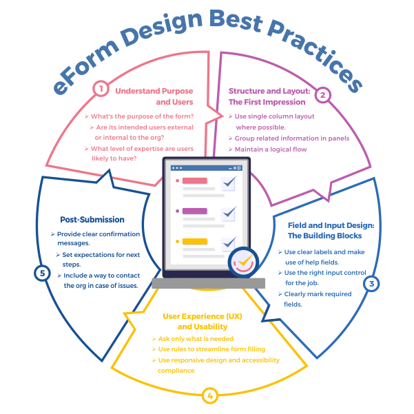
1. Understand Purpose and Users
Before logging into your eForms and Workflow tool to start building your form, ensure you have a clear understanding of the form’s purpose and the users who will be using it.
- Public Forms: Are published online and used by a wide range of potential users and require extra care in design to ensure usability.
- Internal Forms: Are often within private networks, used by a much smaller number of people, and can frequently be abbreviated to accomplish their function.
2. Structure and Layout: The First Impression
The overall layout is the first thing a user sees. A clean, logical structure reduces cognitive load and encourages completion.
- Use a Single-Column Layout whenever possible: This is the most critical layout principle. A single column creates a clear, straight path for the user to follow from top to bottom. This makes it easier for the user to scan the information and is exceptionally mobile device friendly. Multiple columns can disrupt a user’s vertical momentum and create confusion about the order of fields.
- Group Related Information: Use panels or tabs to group related fields into objective sections (e.g., “Personal Information,” “Shipping Address,” “Payment Details”). The different groups help make the form feel less daunting by breaking it up into manageable chunks.
- Order Fields Logically: Start with the easiest and least sensitive questions (like name and email) and progress to more complex or sensitive ones (like payment information). This builds momentum and user commitment.
- Use a Progress Indicator for Multi-Step Forms: If your form spans multiple pages, show the user where they are in the process (e.g., “Step 2 of 4”). This manages expectations, reduces anxiety, and motivates them to finish.
3. Field and Input Design: The Building Blocks
The design of individual fields determines how easily a user can input their data.
- Top-Align Your Labels: Place the label for a field directly above the input box. Research consistently shows this is the fastest layout for users to process because their eyes can move down the form in a single, straight line.
- Avoid Placeholders as Labels: A common mistake is to use placeholder text (the gray text inside a field) as the only label. Once the user starts typing, the label disappears, forcing them to rely on memory. Use a dedicated label element and use placeholders only for examples or hints (e.g., example@email.com).
- Use the Right Input Type for the Job:
- Message boxes: For presenting text such as instructions on the form.
- Radio Buttons: For 2-5 mutually exclusive options (e.g., Yes/No).
- Checkboxes: For selecting one or more options from a list.
- Dropdowns/Select Menus: For a long list of known options (e.g., a list of countries or states) to save space.
- Text Input: For open-ended data like names or comments.
- Advanced controls: Make use of any pre-configured controls to capture eSignatures and process payments.
- Clearly Mark Required vs. Optional Fields: The standard convention is to use an asterisk (*) for required fields. For forms where almost everything is needed, it can be less visual clutter to mark the few optional fields instead.
- Use Input Masks for Formatted Data: For sensitive things like phone numbers, ID numbers, etc, an input mask guides the user’s formatting as they type (e.g., (*** ) *** – ****). This prevents validation errors and standardizes your data.
4. User Experience (UX) and Usability
These practices focus on making the interaction smooth and frictionless.
- Only Ask for What You Need: Every extra field you add increases friction and the likelihood of abandonment. Vigorously question the necessity of each field. Do you really need their phone number or will just their email suffice?
- Use Rules for Conditional Logic: Don’t show users irrelevant questions. Use the rules engine in your form tools, specifically its AI-assisted logic system- to show or hide fields based on their previous answers. For example, if a user selects “United States” as their country, only then should the “State” dropdown be shown. This makes the form feel shorter and more personal.
- Make Use of Integrations: Whenever possible, connect input controls to information stored in tables, databases, or other systems to enable auto-filling of fields on the form. This saves the user time and effort.
- Design a Clear and Compelling Call-to-Action (CTA) Button:
- Make it stand out: Use a contrasting color that draws the eye.
- Use descriptive text: Instead of a generic “Submit,” use a verb that describes the outcome, like “Create My Account,” “Get Your Free Quote,” or “Complete Purchase.”
- Place it logically: At the end of the form, where the user expects it.
5. Communication and Feedback
Clear communication prevents errors and builds trust.
Use Rules for Real-Time (Inline) Validation: Don’t wait until the user clicks “Submit” to tell them they’ve made an error. Validate fields as the user fills them out or moves to the next one. A clear, red error message for failure provides immediate feedback.
Write Helpful Error Messages: An error message like “Invalid Input” is useless. Be specific and tell the user exactly how to fix the problem.
- Bad: Error
- Good: Your password must be at least eight characters long and contain one number.
- Provide “Help” Text Where Needed: For fields that might be ambiguous, provide a small, unobtrusive tooltip or help text that clarifies what’s needed.
6. Mobile and Accessibility
Your form must work for everyone, on every device. The best eForms tools do this automatically, but if not, the following must be done as part of the form design process.
- Ensure Responsive Design: The form must adapt seamlessly to any screen size, from a large desktop monitor to a small smartphone. Buttons and fields should be large enough to be easily tapped with a thumb.
- Follow Accessibility Guidelines: Ensure your form can be navigated and completed using a keyboard alone. Make sure enough color contrast has been used between text and background.
7. Post-Submission
The user’s experience doesn’t end when they click submit.
- Provide Clear Confirmation: After submission, redirect the user to a “Thank You” page or display a clear success message. Never leave them on the same page, wondering if it worked.
- Set Expectations: On the confirmation page, tell the user what happens next. “Thank you for your submission! We will respond to your inquiry within 24 business hours.”
- Reassure Users About Security: If you are collecting sensitive data, display trust signals like security seals, a privacy policy link, and ensure the form is served over HTTPS. A simple statement like “We value your privacy and will not share your information” can go a long way.
By applying these best practices you too can create eForms with workflows that are powerful and effective, while also easy to complete by the intended users. To further enhance your form-building expertise, you can explore additional resources by visiting https://www.dbsgroup.net/tag/eforms/

dbs Software & Services (dbs) is a long-standing provider of document management and process automation solutions for education and business, and the exclusive provider of Tessi Docubase® in North America.
Tessi Docubase® is an enterprise-grade modular, secure, and easy-to-use document management system that seamlessly integrates with Business Information Systems. Its secure architecture and a broad range of features make it the perfect solution for a wide range of enterprises and use cases.
dbs LiveForms, is a low-code Business Process Automation platform. Its sole focus is simplifying complex processes by automating repetitive steps – from data capture to alerts, notifications, email confirmations, and everything in between quickly, without involving a programmer.
dbs eSign is a cloud-based electronic signature solution that allows users to manage the signing process for a document, from upload to signing and sealing, from any mobile device or computer.
Stay up to date with all our document management blogs and content by following us on LinkedIn

Leave A Comment